How the NFL Fooled its Own Announcers with its Score Graphic
There is something about the nostalgia of football and the smell of a crockpot of simmering chili on a Fall Sunday afternoon that is hard to beat. I grew up watching Sunday football over the years - and with it came changes to the NFL’s animations, graphics, and designs (remember the introduction of the FOX robot?)
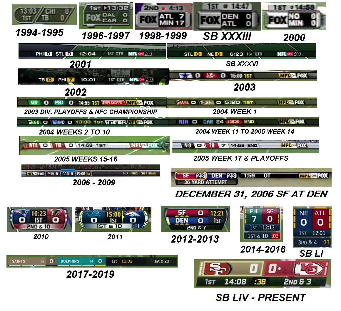
Every few years, the NFL updates its Score Graphic. This consists of important information for viewers to understand the status of the game, including: The score of each team, which quarter the game is in, Game Clock, down, yardage, Play Clock, and timeouts.
In the 2020 season, I noticed an issue with the design of the 2020 Score Graphic after it confused Fox’s broadcast announcer in a game where the Washington Football Team (now the Commanders) faced off against the Philadelphia Eagles.
Washington was driving towards the Endzone with roughly 45 seconds left before Halftime. The announcer commented - “They really need to hurry up here or call a timeout - there are only about 15 seconds left in the Half!”
But that was wrong.
After realizing his gaffe, the broadcaster said “Sorry folks, there’s about 40 seconds remaining. Here’s what the coach should be thinking about…”
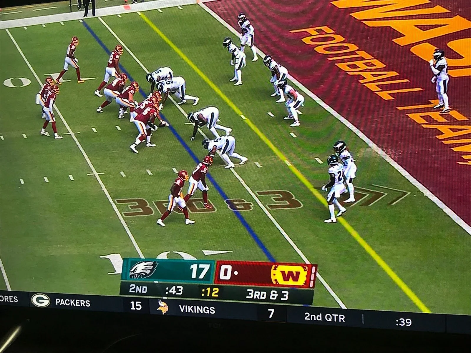
How did this happen? The broadcaster confused the Play Clock (time remaining to start the Play) with the Game Clock (time left in the Game or Quarter). Don’t worry Mr. Broadcaster- it’s not your fault! This confusion was an unintended consequence of the design.
As champions of the user experience, it’s our responsibility to uncover the WHY behind user error. So, let’s dissect this a little bit.
Analysis
The format of the design clearly depicts the main statuses - teams, score, etc. However, the Play Clock (:12 seconds) is located in the center, in bright yellow, with a darker background around the text. The Game Clock (:43) is located to the left center in white text aligned with the font color of the Quarter.
So what might have caused this confusion?
The design of the Play Clock itself draws the attention of the user as the primary piece of information, when it should be secondary within the hierarchy.
It’s Yellow when everything else is White. One of the 7 Principles of Design is Emphasis. “This is when a specific element is given to a distinguishing feature to separate it from a certain element or group.” - Credit: The Zizzo Group
Unintentionally, this draws the audience’s eye as it emphasizes the difference with the unique color. The darker background takes it one step further, applying a bigger weight to this part of the design.
This can also be seen in the 5 Principles of Visual Design for UX - Contrast - as shown here in the Nielson Norman Group Article. By contrasting the color for the Play Clock, the design creates a juxtaposition against the other elements which makes it stand out further.
It’s smack in the middle. Another Principle of Visual Design for UX is Visual Hierarchy. This principle helps designers “control the delivery of the experience” on a page by highlighting how important an item is through size, color, location, shape etc. This ‘mini information architecture’ process typically helps a user know where to look first, but instead drew the audience towards the centered, differentiated element on the page.
It’s important that designers consider how to prioritize the significance of information and rely on key design principles to highlight the most important elements on the page. What is the level of importance of information on the page (primary, secondary, tertiary, etc?) and do the elements of visual design map to the natural hierarchy of tasks?
Consequences and Severity
Fortunately, this small Score Graphic confusion is a niche situation for the NFL that also doesn’t have a huge impact on the viewer’s experience of the game.
Throughout the majority of the game, there is a lower probability of confusing a 7 minute 34 second game clock with a Play Clock that tops out at 40 seconds. Also, if the audience makes an error in interpreting the design, there is only a brief mental readjustment to understand the proper formatting, which they only need to learn once. Seeing the Play Clock reset or another fan explaining the difference between the Game Clock or Play Clock’s resolves the issue. Crisis avoided!
It’s easy to retroactively analyze this after the fact or shrug off this misunderstanding that corrects itself in a few seconds. However, these have important implications for the design process for both digital and physical systems:
What if there are larger consequences at stake for your design? It is crucial for designers to consider the outcomes for users who improperly interpret the systems, where those linchpins are in the system, and how you can counteract as many of those as possible. Remember the accidental Hawaii missile warning?
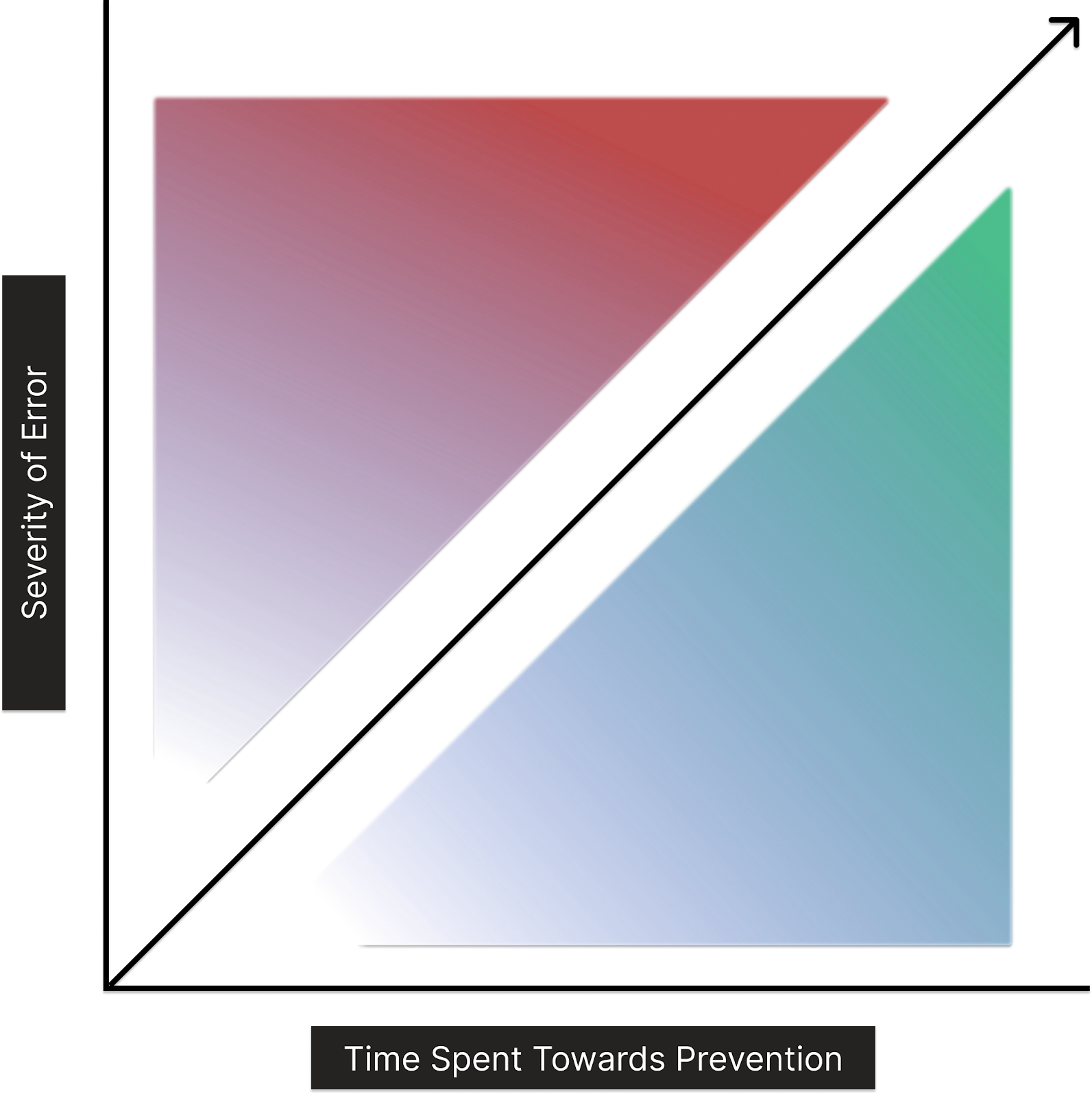
A rule of thumb for design teams to keep in mind when building a system: the time spent considering the possible outcomes and consequences of a design should be proportional to the level of severity of the error.
Despite having time and resource constraints, designers should consider the severity of the results of the project, feature, or system for their organization. If there is a higher chance for a negative or more significant outcome, the higher the emphasis should be on testing and identifying problems before rollout. The ratio of preventing the error should be equal to the consequences that can occur from the user making a mistake. This can be applied to e-commerce checkout, inputting wire transfer details for a banking app, or a missile warning system.
As with any design, this applies not only to product implementation but post-rollout. This includes but is not limited to internal training and public facing communications - whether it’s B2B client facing teams, panel controllers at missile sites, or announcers for the NFL. Those who use the systems must be equally as prepared to deal with and correct the consequences of misunderstanding the systems they have to operate.
Accessibility and Edge Case Probability
Another point of consideration for any design should be how accessible the design is to the different audiences as they interpret the interface and how that changes with edge cases in the system.
Is this design applicable to different scenarios? Will users be able to successfully interpret and use the design at different entry points (i.e. 13 Minutes left in the Quarter vs. 24 seconds left in the Quarter)?
As important as the points of the customer journey, is understanding the level of accessibility you’re designing for.
In this case, the NFL is designing for an audience of roughly 15 Million across multiple demographics. This means that simplicity and accessibility should be key considerations along with aesthetic features that please target audiences if they distract from the primary function of the graphic. Aesthetics and features need to complement function, not impede it.
If an announcer with 10 years of experience cannot immediately understand your design, how likely is it that someone who attends an occasional SuperBowl party once a year will be able to quickly identify the right information?
These are all considerations that should be taken into account when building a design and a system, whether virtual or physical.
So, takeaways: We should always check that our visual hierarchies are clear and accessible by our audiences - remember - we are not the user! When building systems, we should be intentional about calling out errors and outcomes for our experiences.
Whether it’s a Sunday afternoon with football or larger, more critical systems, we can be intentional about recognizing and planning to prevent more severe outcomes; we can continue to optimize for success across both the design and those engaging with it.